
 Arizona Diamondbacks
 Atlanta Braves
 Baltimore Orioles
 Boston Red Sox
 Chicago Cubs
 Chicago White Sox
 Cincinnati Reds
 Cleveland Guardians
 Colorado Rockies
 Detroit Tigers
 Houston Astros
 Kansas City Royals
 Los Angeles Angels
 Los Angeles Dodgers
 Miami Marlins
 Milwaukee Brewers
 Minnesota Twins
 New York Mets
 New York Yankees
 Oakland Athletics
 Philadelphia Phillies
 Pittsburgh Pirates
 San Diego Padres
 San Francisco Giants
 Seattle Mariners
 St. Louis Cardinals
 Tampa Bay Rays
 Texas Rangers
 Toronto Blue Jays
 Washington Nationals
 Atlanta Hawks
 Boston Celtics
 Brooklyn Nets
 Charlotte Hornets
 Chicago Bulls
 Cleveland Cavaliers
 Dallas Mavericks
 Denver Nuggets
 Detroit Pistons
 Golden State Warriors
 Houston Rockets
 Indiana Pacers
 Los Angeles Clippers
 Los Angeles Lakers
 Memphis Grizzlies
 Miami Heat
 Milwaukee Bucks
 Minnesota Timberwolves
 New Orleans Pelicans
 New York Knicks
 Oklahoma City Thunder
 Orlando Magic
 Philadelphia 76ers
 Phoenix Sun
 Portland Trailblazers
 Sacramento Kings
 San Antonio Spurs
 Toronto Raptors
 Utah Jazz
 Washington Wizards
 Arizona Cardinals
 Atlanta Falcons
 Baltimore Ravens
 Buffalo Bills
 Carolina Panthers
 Chicago Bears
 Cincinnati Bengals
 Cleveland Browns
 Dallas Cowboys
 Denver Broncos
 Detroit Lions
 Green Bay Packers
 Houston Texans
 Indianapolis Colts
 Jacksonville Jaguars
 Kansas City Chiefs
 Las Vegas Raiders
 Los Angeles Chargers
 Los Angeles Rams
 Miami Dolphins
 Minnesota Vikings
 New England Patriots
 New Orleans Saints
 New York Giants
 New York Jets
 Philadelphia Eagles
 Pittsburgh Steelers
 San Francisco 49ers
 Seattle Seahawks
 Tampa Bay Buccaneers
 Tennessee Titans
 Washington Commanders
 Anaheim Ducks
 Arizona Coyotes
 Boston Bruins
 Buffalo Sabres
 Calgary Flames
 Carolina Hurricanes
 Chicago Blackhawks
 Colorado Avalanche
 Columbus Blue Jackets
 Dallas Stars
 Detroit Red Wings
 Edmonton Oilers
 Florida Panthers
 Los Angeles Kings
 Minnesota Wild
 Montreal Canadiens
 Nashville Predators
 New Jersey Devils
 New York Islanders
 New York Rangers
 Ottawa Senators
 Philadelphia Flyers
 Pittsburgh Penguins
 San Jose Sharks
 Seattle Kraken
 St. Louis Blues
 Tampa Bay Lightning
 Toronto Maple Leafs
 Vancouver Canucks
 Vegas Golden Knights
 Washington Capitals
 Winnipeg Jets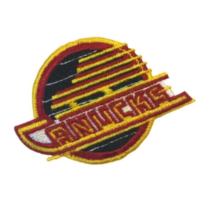
Vancouver Canucks Embroidered Patches
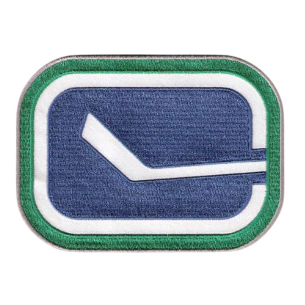
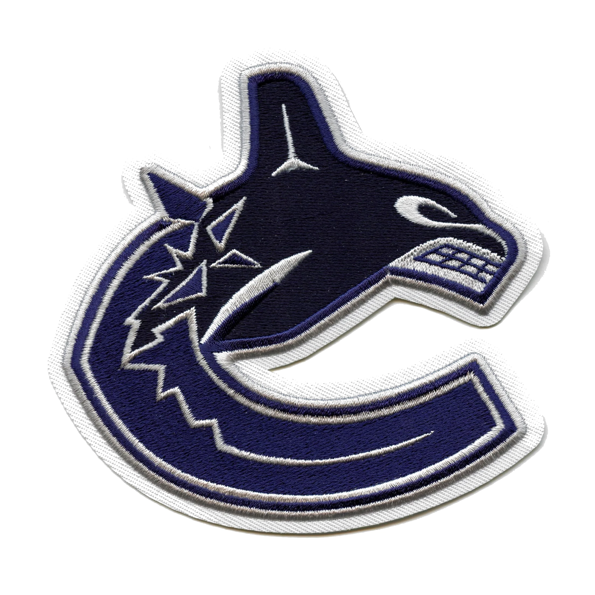
Founded in 1970, the Canucks have gone through more distinct logo eras than most NHL franchises, and this vancouver canucks patch lineup reflects that range rather than sticking to a single design. Blue and green run through the current branding, and the orca-bursting-through-an-ice-“C” logo, the current primary mark, ties directly to the Pacific Northwest setting the team represents.
That orca design is fairly detailed, with the whale’s motion and the ice-shard edges around the “C” needing careful stitching to keep sharp rather than blurring together.
The canucks 40th anniversary patch and canucks 50th anniversary patch each mark a specific franchise milestone rather than the everyday ongoing logo, tied to those particular seasons instead of standard team branding. Worth checking which anniversary you’re after, since they’re distinct designs rather than variations on the same theme.
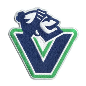
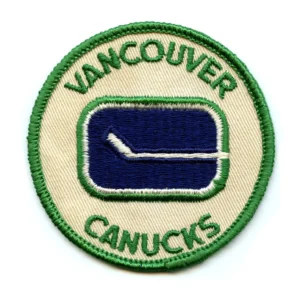
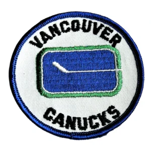
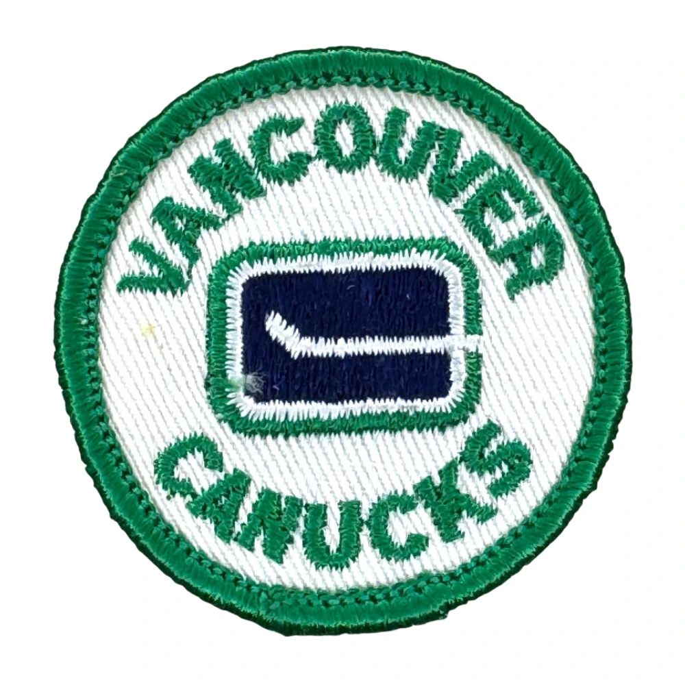
There’s also a vintage round logo pulling from the 1970s, plus the “V” and Johnny Canuck crest from a later era, both distinct departures from the current orca design that longtime fans specifically associate with different decades of the team’s history.
Every canucks patch here uses actual stitched thread instead of a printed transfer, so fine detail like the orca’s outline or the anniversary numbering holds its shape through repeated washing instead of cracking or fading. Backing comes in iron-on, sew-on, or Velcro, depending on whether the patch stays on one piece of gear or moves between a few.