
 Arizona Diamondbacks
 Atlanta Braves
 Baltimore Orioles
 Boston Red Sox
 Chicago Cubs
 Chicago White Sox
 Cincinnati Reds
 Cleveland Guardians
 Colorado Rockies
 Detroit Tigers
 Houston Astros
 Kansas City Royals
 Los Angeles Angels
 Los Angeles Dodgers
 Miami Marlins
 Milwaukee Brewers
 Minnesota Twins
 New York Mets
 New York Yankees
 Oakland Athletics
 Philadelphia Phillies
 Pittsburgh Pirates
 San Diego Padres
 San Francisco Giants
 Seattle Mariners
 St. Louis Cardinals
 Tampa Bay Rays
 Texas Rangers
 Toronto Blue Jays
 Washington Nationals
 Atlanta Hawks
 Boston Celtics
 Brooklyn Nets
 Charlotte Hornets
 Chicago Bulls
 Cleveland Cavaliers
 Dallas Mavericks
 Denver Nuggets
 Detroit Pistons
 Golden State Warriors
 Houston Rockets
 Indiana Pacers
 Los Angeles Clippers
 Los Angeles Lakers
 Memphis Grizzlies
 Miami Heat
 Milwaukee Bucks
 Minnesota Timberwolves
 New Orleans Pelicans
 New York Knicks
 Oklahoma City Thunder
 Orlando Magic
 Philadelphia 76ers
 Phoenix Sun
 Portland Trailblazers
 Sacramento Kings
 San Antonio Spurs
 Toronto Raptors
 Utah Jazz
 Washington Wizards
 Arizona Cardinals
 Atlanta Falcons
 Baltimore Ravens
 Buffalo Bills
 Carolina Panthers
 Chicago Bears
 Cincinnati Bengals
 Cleveland Browns
 Dallas Cowboys
 Denver Broncos
 Detroit Lions
 Green Bay Packers
 Houston Texans
 Indianapolis Colts
 Jacksonville Jaguars
 Kansas City Chiefs
 Las Vegas Raiders
 Los Angeles Chargers
 Los Angeles Rams
 Miami Dolphins
 Minnesota Vikings
 New England Patriots
 New Orleans Saints
 New York Giants
 New York Jets
 Philadelphia Eagles
 Pittsburgh Steelers
 San Francisco 49ers
 Seattle Seahawks
 Tampa Bay Buccaneers
 Tennessee Titans
 Washington Commanders
 Anaheim Ducks
 Arizona Coyotes
 Boston Bruins
 Buffalo Sabres
 Calgary Flames
 Carolina Hurricanes
 Chicago Blackhawks
 Colorado Avalanche
 Columbus Blue Jackets
 Dallas Stars
 Detroit Red Wings
 Edmonton Oilers
 Florida Panthers
 Los Angeles Kings
 Minnesota Wild
 Montreal Canadiens
 Nashville Predators
 New Jersey Devils
 New York Islanders
 New York Rangers
 Ottawa Senators
 Philadelphia Flyers
 Pittsburgh Penguins
 San Jose Sharks
 Seattle Kraken
 St. Louis Blues
 Tampa Bay Lightning
 Toronto Maple Leafs
 Vancouver Canucks
 Vegas Golden Knights
 Washington Capitals
 Winnipeg Jets
Uncategorized
The History of MLB Team Patches: From Wool to Modern Embroidery
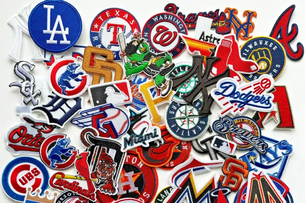
I’ve always found it a little funny that a piece of fabric smaller than a coaster can carry so much weight. A memorial patch. A championship patch. A sleeve that quietly tells you what a team just went through. Baseball has been doing this for over a century, and the story of how we got here says as much about manufacturing as it does about sentiment.
The wool years
Baseball uniforms started as wool, full stop. The New York Knicker bockers put on matching blue wool uniforms back in 1849, and for the next several decades, teams stuck with heavy flannel and wool blends because that’s what durable clothing meant at the time. Nobody was thinking about breathability. They were thinking about a fabric that could survive a season of sliding, sweating, and getting washed by hand.
That heaviness mattered for patches too. Early decoration on a uniform wasn’t really “patches” as we’d recognize them. It was stitched-on lettering, direct embroidery onto the wool itself, or, in the case of college ball, felt letters sewn on to mark an achievement. The chenille tradition (that fuzzy, looped-yarn look you still see on old varsity jackets) traces back to exactly this era, when Harvard students in the mid-1800s started sewing an “H” onto uniforms to single out their standout players.
When patches started meaning something specific
The first real commemorative sleeve patch in MLB shows up in 1907, when the Chicago White Sox marked their World Series win from the year before with a patch on the jersey. It wasn’t subtle (teams back then weren’t shy about announcing a championship), but it set a template clubs would return to again and again over the following century.
Memorial patches took a lot longer to catch on. For most of the 20th century, teams honored deceased players and staff with a plain black armband, nothing more. That changed in 1973, when the Pittsburgh Pirates put a “21” patch on their sleeves for Roberto Clemente, who’d died in a plane crash that December while delivering aid to earthquake victims in Nicaragua. It was the first true memorial in MLB Patches history. Even after that, armbands stuck around as the default for another decade or so, and patches didn’t really take over as the standard until the mid-1980s.
Numbers, names, and the pieces around the patch
Patches didn’t grow up in isolation. They developed alongside the rest of uniform identity: numbers, names, and logos. Cleveland put numbers on sleeves in 1916. The Yankees moved numbers to the back not long after, originally tied to batting order. By 1932, every big-league player had one. The Dodgers were the first to put a number on the front of a home jersey, in 1952. None of this is directly about patches, but it’s the same impulse: turning a uniform into something that identifies a specific person, a specific team, a specific moment, instead of just clothing.
Wool goes out, polyester comes in
By the early 1960s, wool was on its way out across MLB, replaced first by flannel blends and then, by the late ’60s and early ’70s, by cotton-poly and eventually double-knit stretch fabrics. The Pirates were early adopters of the pullover, beltless look in the late ’60s, and by 1973 all 24 major-league teams had switched to some version of stretch-knit uniforms.
This is also roughly when uniforms got weird, and I mean that as a compliment. The Astros’ rainbow stripes, the Pirates’ black-and-gold pullovers, Oakland’s green-and-gold combo. Polyester let designers do things wool never could, and patches got to ride along on brighter, lighter fabric that held a design better.
From chenille to computerized embroidery
The manufacturing side is where things get genuinely interesting, and it’s mostly invisible unless you go looking for it. A chenille patch is built by looping yarn over a felt base with a specialized machine, then trimming the loops for that raised, fuzzy texture: great for bold shapes and lettering, bad for detail. Standard embroidered patches work differently. Thread is stitched directly onto a twill or felt backing, which lets you render fine lines, small text, and shading that chenille just can’t do.
For most of the 20th century, that stitching was done on machines that required real manual skill. Companies like Roman Art Embroidery Corp (formed in the 1950s) became go-to suppliers for pro uniforms and caps precisely because good embroidery was a craft, not a formula. Sports Specialties, founded in 1928 and later the first company to produce officially licensed pro-team merchandise, became MLB’s official cap licensee in 1984, known for thick wool caps with flat, dense embroidery.
Multi-needle computerized embroidery changed the math. Modern machines can lay down 12 to 15 stitches per millimeter, so a patch can now hold detail that would’ve been impossible to stitch by hand at any reasonable speed. It’s also why teams can produce a new commemorative patch for basically any occasion without months of lead time.
Patches as the sport’s ongoing scrapbook
Look at what MLB has put on sleeves over the years and you’re basically reading a timeline of the league’s self-regard. The AL’s 100th anniversary in 2001. The league-wide MLB 150 patch in 2019, marking the 1869 Cincinnati Red Stockings as the first openly salaried pro team. Every U.S. team wore a patch honoring 9/11 victims that season. Jackie Robinson Day patches. Lou Gehrig Day patches. Team-specific anniversary patches that show up almost every year now: the Blue Jays’ 50th, the Mariners’ 50th, the Cubs’ 150th, all landing in 2026 alone.
Championship patches followed their own path too. The 2004 Marlins were the first team to wear a “World Series Champions” patch for a full season rather than just a one-off ceremony, and that became the norm. The Red Sox, White Sox, Cardinals, Phillies, and Giants all did versions of it through the 2010s.
Why it still matters
This isn’t really about textiles anymore, even though it started there. A patch is cheap to produce relative to a full uniform redesign, which is exactly why MLB leans on them so heavily now. You get a fresh, telegenic detail every season without touching the core look fans are attached to.
But there’s also something real underneath the marketing logic. A “21” on a Pirates sleeve in 1973 wasn’t a product decision. It was a team publicly grieving in the most visible way available to them. That’s the part of this history I keep coming back to: the fabric changed, the machines changed, but the impulse to put something small and specific on your sleeve, something that says this happened, and it mattered, hasn’t changed at all.
